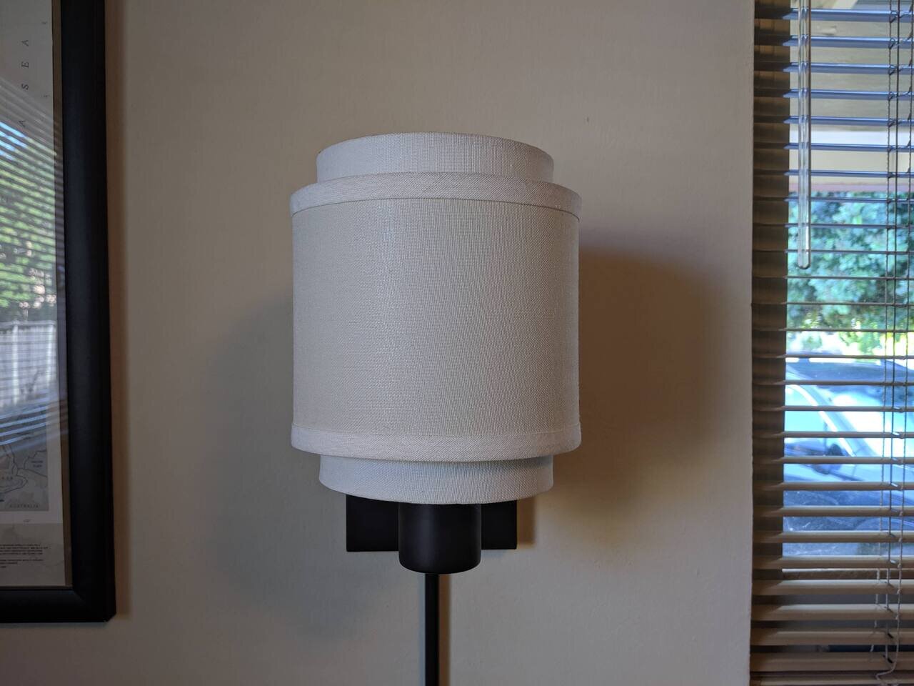
2019-06-21 – Google Pixel 3a
small Ikea wall lamp, San José, California
🎵 (youtube) Die Taucher «Atlantis»
couple small affectations for these notes – I’ve been using (mostly) lowercase for the notes, I’ve been using space-endash-space instead of period-space for separating sentences, and I’ve been using «guillemets» instead of “curly quotes” for quote marks (not to be confused with the seabird «guillemot», but both named after a Guillaume) – and both Apple and X11 named the marks «guillemots» instead of «guillemets»
In France, by the end of the nineteenth century, the marks were modified to an angular shape: «...». Some authors claim that the reason for this was a practical one, in order to get a character that was clearly distinguishable from the apostrophes, the commas, and the parentheses. Also, in other scripts, the angular quotation marks are distinguishable from other punctuation characters: the Greek breathing marks, the Armenian emphasis and apostrophe, the Arabic comma, the decimal separator, the thousands separator, etc. Other authors claim that the reason for this was an aesthetic one: the elevated quotation marks created extra white space before and after the word, below the quotation marks. This was considered aesthetically unpleasing, while the in-line quotation marks helped to maintain the typographical color, since the quotation marks had the same height and were aligned with the lower case letters.
➡️ the day after
⬅️ the day before
⬅️ the month before
🔗 rss