Cauliflower, Thursday, 27 November 12025 HE
Chou-fleur, Septidi, 7 Frimaire An CCXXXIV
C, a.d. V Kal. Dec. AUC MMDCCLXXVIII
13.0.13.2.4, 9 K’an 2 Mak, Tepeyollotl
19X09 | 2461007

2012-11-16 – Olympus PEN E-PL1
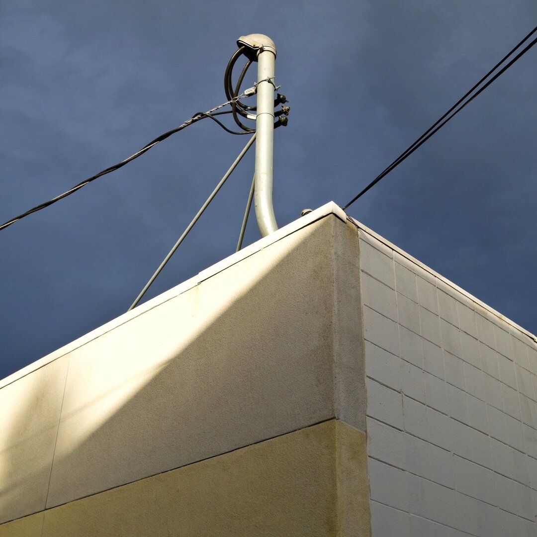
weatherhead, cinderblock, and stucco, San José, California
Marnik feat. Hard Lights – “Butterfly” ↗
within typography, there’s a constant balance between “legibility” and “readability” – legibility refers to how easy something is to read while readability refers to how much you want to read something – readability is driven by familiarity – Times New Roman is not a great font but it’s a familiar font – even now, we still associate it with newspapers and news and reports and editorials
within the world of operating systems, Linux is the sans-serif typeface, legible and utilitarian – Windows is the Times New Roman, ugly but familiar – switching from Windows to Linux is not held back by features or power or apps or security or reliability, it’s being held back by a simple lack of familiarity – it’s not that people are afraid of the new, it’s that they’re comfortable with the old, a level of comfort that can only be built up over years and decades
the day after
the day before
the month before
the quarter before
the year before